Intro: Visual Search
Challenge + Response
Role: Senior Designer > Shaun Post
Credit: Design Manager > Mark Waldo | Designers > Andrea Zehr, Peiqi Tang & Rupa Chaturvedi
Developed: 2016 - Present iOS + Android Platforms
Modes are features customers can use to make their shopping experience frictionless across Amazon's mobile App. Customers can engage a variety of camera-based solutions such as visual search for products, barcode scanning, previewing products in augmented reality and more! Our team helped solve multiple complex problems on this release including improving image query framing, unexpected results and awareness of capabilities and overall raised the bar in visual and interaction design.
1. Results - Better search results; 66% match rate > goal of 85% (FY 17’)
2. Ingress - Multiple ingress points; organic way of discovering modes
3. Options - What are other reasons for using visual search?
4. Barcode - Barcode is still King; catering to our primary audience (80%)
Part I: The Investigation Begins...
Define
Challenge: Do customers know the possibilities and benefits of visual search? The answer is, no. Most customers don’t know this feature exists on Amazon. Our team needs to make our feature more discoverable by adding contextual ingress points, increase match rate, ground truth clarity.
Recommendation: Modes. Customers can engage a variety of camera-based solutions such as visual search for products, barcode scanning, previewing products in AR and more. Educating customers on all the possibilities.
---
What are our requirements?
Results - Better search results; 66% match rate > goal of 85% (FY 17’)
Accessibility - Integrating accessible design thinking throughout the cycle.
Discoverability - Multiple ingress points; organic way of discovering modes
Barcode - Barcode is still King; catering to our primary audience (80%)
Research
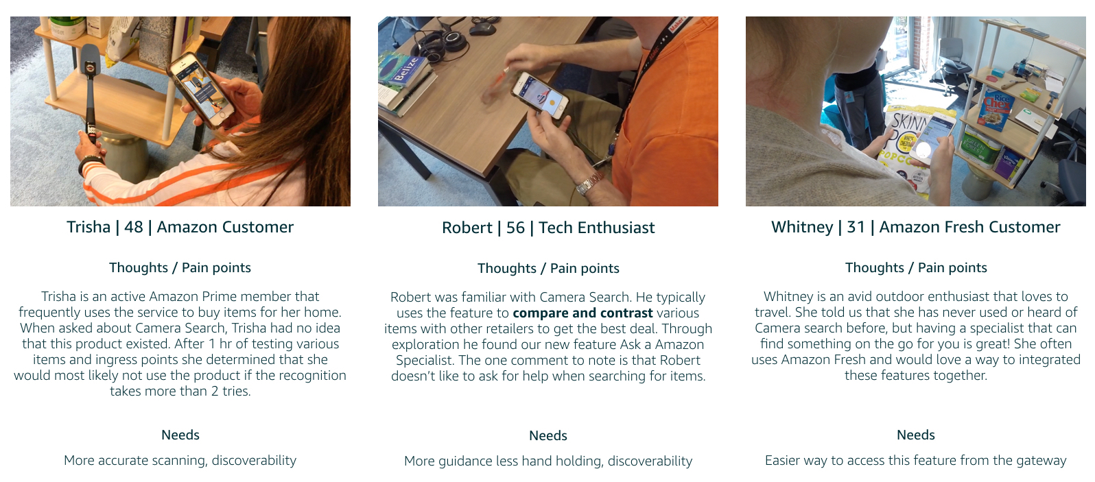
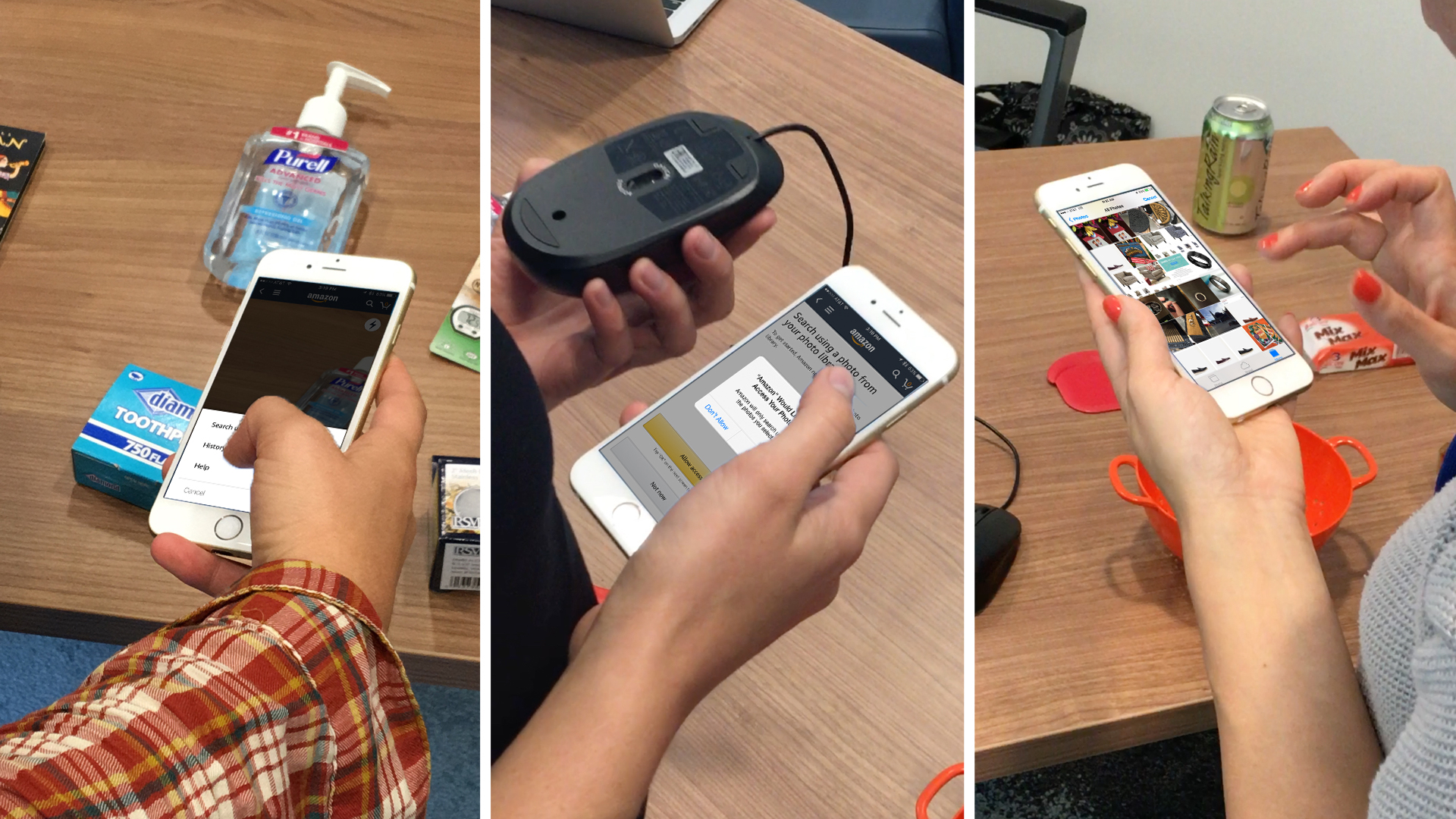
Worked closely with UX Researchers to study individuals from all backgrounds and with a variety of abilities on the existing Visual Search experience and create additional requirements. PM’s and Design would then create a PR/FAQ outlining our roadmap and work with dev to develop sprints.
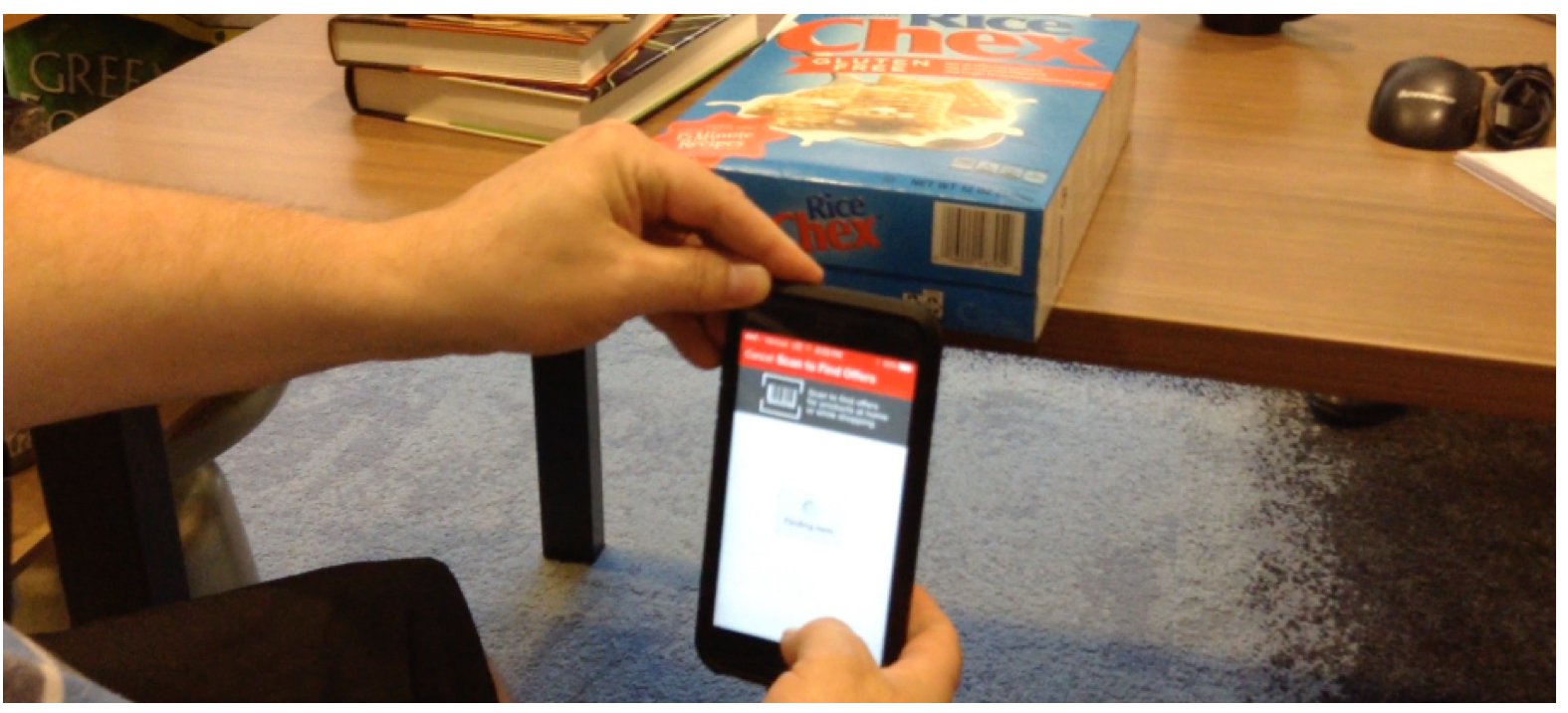
Competitive analysis showed that there are currently other apps on the market that are similar. However these apps only target barcode recognition rather than other match types such as category, image, and logo. Before suggesting new changes to the experience, our team goal was to target customers that have an understanding of the camera search pattern and if they use any other apps that have similar capabilities.
By understanding how customers are supported at other major online and in-store retailers, this can help determine what bar we (Amazon) needs to set in order to support our customer base.
Plan
We started with 4 modes. Product Search, Gift Card, Package X-Ray and Barcode. As we expand, we want to give our customer contextual ways of ingressing into various features through visual search. To rapidly experiment, growth hacking is the best way to gather metrics quick. Look for big wins by increasing match rate and decreasing failure through delight. See below a workflow that diagrams what happens at each stage of success and failure. Taking this into consideration we can find ways to better our exprience to see where customers are getting stuck.
Part II: Design
Concept
The mode sheet (mock 3.18) allows customers to engage with the different features across Amazon mobile shopping. Simply tap a mode and begin interacting. This example shows our product search feature 'scan an item' using machine learning and computer vision we are able to give the customer exact match or recomendations based on generic items such as sunglasses
Compose
Each mode exists to make customers more successful in achieving a particular activity like finding a product faster, getting better results, exploring the Amazon catalogue visually. The features presented in modes have significantly distinct interaction and post-recognition experience as compared to the default mode: product search.
Part III: Ship It and Repeat!
Test
On 11/26/17, we displayed the current modes experience to 158,876 new customers. Only 40,590 (25.5%) of these new customers moved to the next screen by clicking “CONTINUE”. 33,622 (82.8%) of these customers saw the mode sheet by granting camera permission. We lost 125,254 (78.8%) customers with the current experience. How do we fix this? Growth Hack. Experiment various growth opportunities…shorten the onboarding video, try still images, try adding an information card with customer benefits and many more test to increase MAU
Focus on our CORE modes…Product Search, Barcode, and AR (best MAU growth). Give customers the option to discover other modes through new sheet design and gateway ingress points. Taking the customer through an information card right into the experience. Goal is to eliminate the accidental click-through but also to entice the customer to explore.
Analyze & Refine
What did we learn? Our findings gave our product a higher retention rate of about 30% initially and growing (50/50 weblab). As we continue to improve the experience and ingress for this feature we are constantly learning more about our customer and what is truly important to them. Giving the customer more contextual ways of entering visual search has seemed to be more positive than a funnel through our initial gateway.
1. Reduce friction by getting customers into the camera quickly
2. Modes core functionality
3. Onboarding/Support is needed to educate customers
4. Growth hack and experiment as we gather new observational data and metrics


