Intro: Amazon Ad Products
Challenge + Response
Role: Lead Designer
Developed: 2016; Web
Type: Product Design (UX, UI, Visual)
I was challenged with helping to design a system tool called Header Bidding (DTB) for Amazon Advertising. The system allows Publishers to increase their YoY impressions on mobile platforms by removing "the middleman". My response was to begin developing the concept, timeline and the best ways we can test the system since it will be internal facing until release to the public.
Part I: The Investigation Begins...
Define
As stated above the problem and solution for this project. The system tool Header Bidding would provide Publishers and related advertising professionals with a new way to stay on top of the analytics that generate the revenue for mobile advertisements.
Research
During the research I developed personas of both Publishers and like-minded advertisers that could potentially use this service. Below is an example of one of our Publisher personas. What I love to do when the project is complete is to circle back and get real quotes from the Customer that can be used throughout marketing.
Plan
When planning out each phase of the design, user research to me was the most important. Gathering feedback from the existing site and what the publisher's really wanted to get out of the new user experience. Catering to their needs and having empathy for their work helped me in my design overhaul for this platform.
Part II: Design
Concept
The concept began with understanding the existing structure and integrating Header Bidding. I first had to understand from our Client how one might discover Amazon Ad Network (Google, Editorials, Developer Sites, etc) Once that was developed a site map was needed to show the entire big picture and how we fit.
Compose
These are two mocks developed before production. The UX on the left shows the 'Deals' dashboard. This allows a Publisher to create a new deal for the length of the ad campaign. This also allows them to see analytics, edit and adjust the status. The view on the right shows what happens when you choose a 'New Deal'. This allows for a simple form fallout and most importantly the length of the deal that can be adjusted later.
Present
Presenting the idea meant developing key pieces that could be used for marketing of the tool when showing Publishers. I came up with a variety of icons that represent attributes of the system. These were used through my presentation as well as on the public facing site.
Part III: Ship It and Repeat!
Test
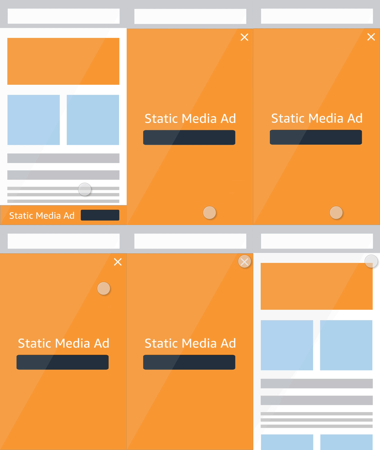
Over a period of a month the tool was testing internally and iterated on various times. Throughout testing we found that it was hard to explain to non-publishers how Header Bidding actually worked and the types of mobile ads you would potentially see on platform. I came up with these GIF animations that show not only the placement of the ad and the type, but how the ad animates.
Refine
Usability showed us that visual representations like the one above are key to showing Customers how advertisements interact. There was also a request to show static images of ad sizes and specs so that Publishers could be exact when submitting their new deals to Amazon Ad Network.
Analyze
Overall the study and development of Header Bidding was successful. We received a lot of great praise and feedback from our network of Customers. This is great to be able to iterate for round 2 and give the Customers more features that will enable them to make this a great self-service platform.


