Intro: Amazon Minigames
Challenge + Response
Role: Lead Designer > Shaun Post
Credit: Design Manager > Mark Waldo
Developed: 2016; Mobile iOS + Android
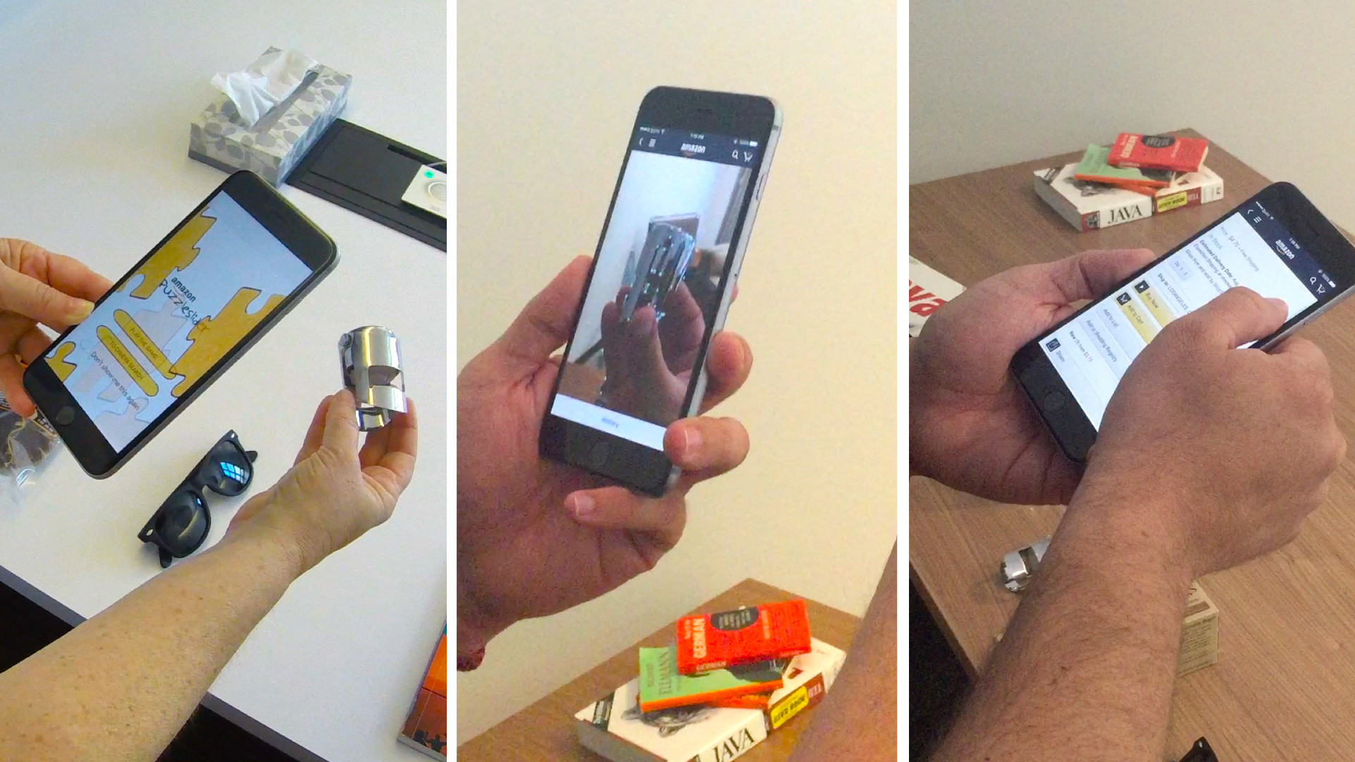
When our Customers submit their photo to 'Ask a Amazon Specialist' for further searching, typically the Customer will exit the app. The challenge we face is how we can keep the Customer fully engaged in the shopping experience until their results are found. Whether that is searching for additional products with the Camera something else more involved.
Through research and testing we've found that delight plays a large part in the success and overall success of mobile apps. The solution I designed are a series of Minigames, based on Amazon products. Building a product is just one part of the process, but you have to think about the complete package. Building a brand meant not only having a consistent look and feel, but how this integrates with the Amazon Platform. I built this product to sit below the Amazon Mobile Platform; and hidden world where Customers can discover on their own when interacting with the shopping experience.
Part I: The Investigation Begins...
Define
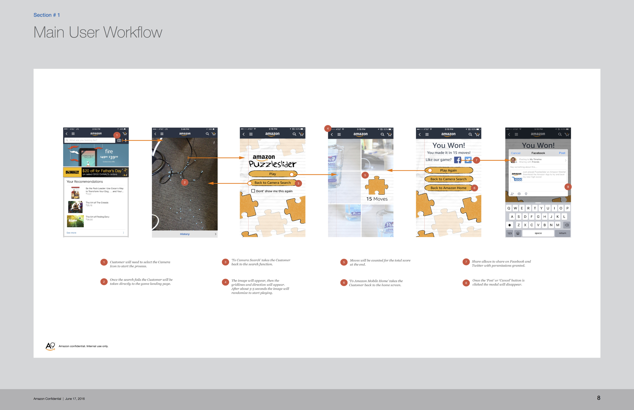
Minigames can be a lot fun; especially if designed around the experience. When a Customer submits their photo for evaluation a option will be given to them to play a game as a form of waiting for 5-10 minutes. This result will keep the Customer engaged in the shopping mentality while their product is processed. The problem seems simple; create a 1-3 minigames that can be used at this ingress of search. The bigger challenge faced is how to make this feels like a consistent experience.
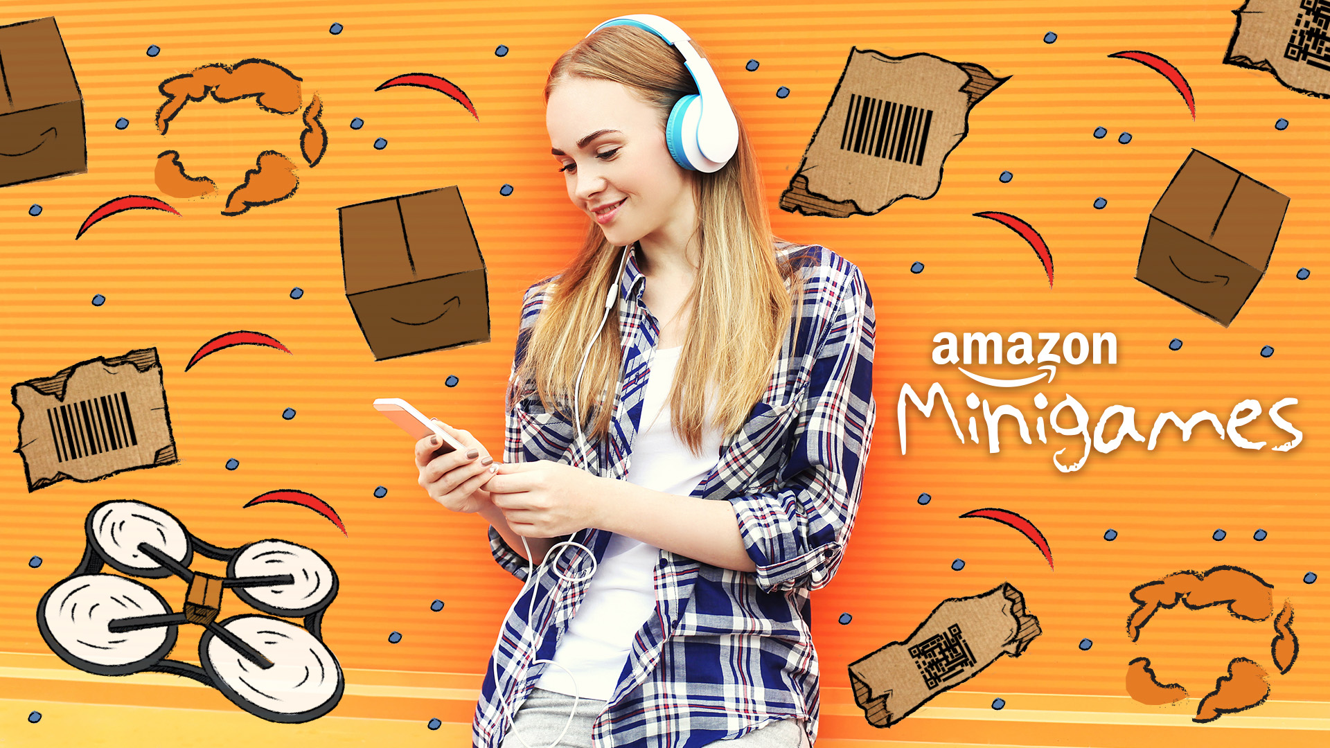
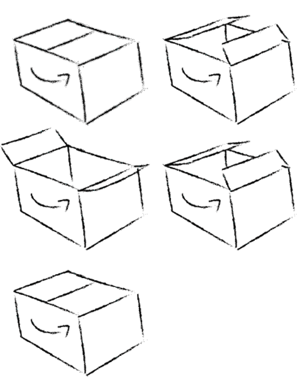
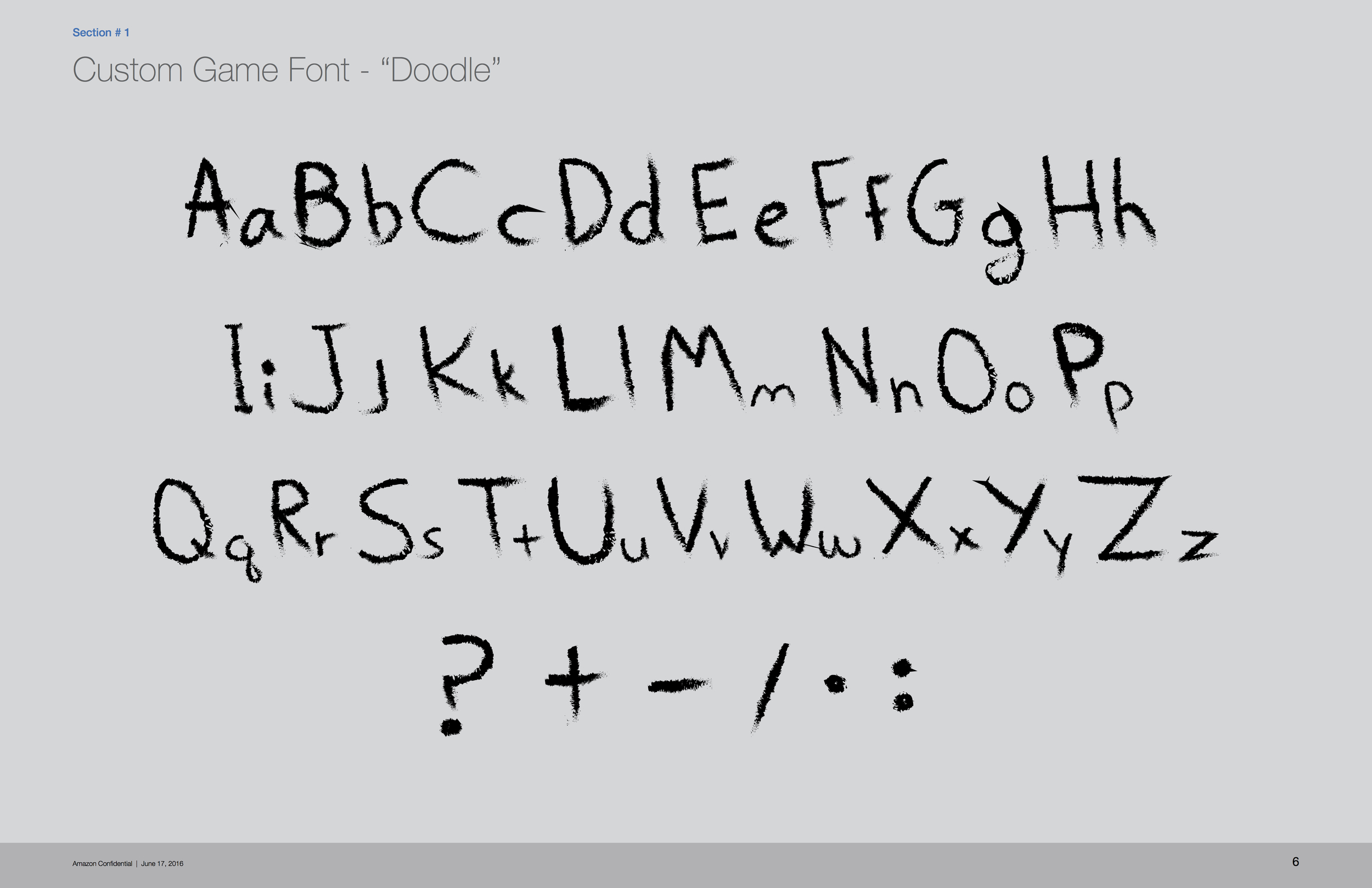
Animation was a huge component of this new challenge and I wanted the style and animation to go hand in hand. Below are a couple examples that show off the childish look I was going for. Once I had the basics drawn out, it was time to dive deep into the UX and figure out how one would discover this new world.
Research
Initial research began thinking about personas the and type of Customers that could potentially find our feature delightful. Kids under a specific age will most likely enjoy this experience; although they do not have the disposable income adults do. Therefore there is a small percentage of Customers that would actually take part in Minigames if presented based on the scenario.
Plan
When planning out the phases of this delight feature, it was important to get the feature tested and implemented into a web lab. As our team has started to get into more delight ingress points, it was critical to understand Customer feedback. Being able to analyze the usability, focus groups and surveys would help in the long run.
Part II: Design
Concept
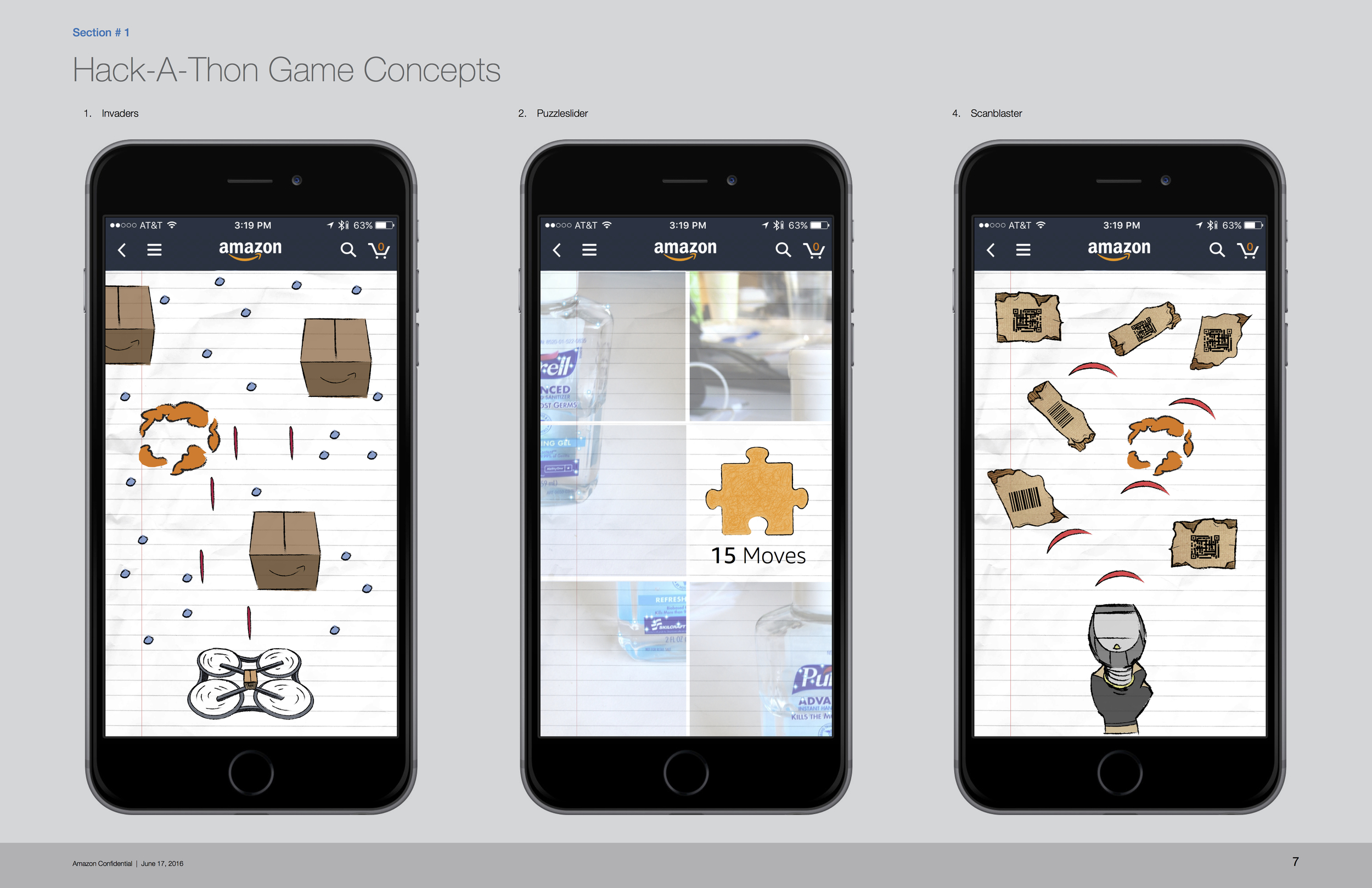
Sketching out my ideas are to me the most important part of design. This is where I get to be loose, discover, work with others and figure out style and an overall workflow. This project was particularly exciting for me because I was given the opportunity to use my own style of illustration to develop a great feature/product for one the largest online retailers out there; Amazon. Below are a few mocks that show a game called "Invaders" based on the classic arcade game of our time.
Compose
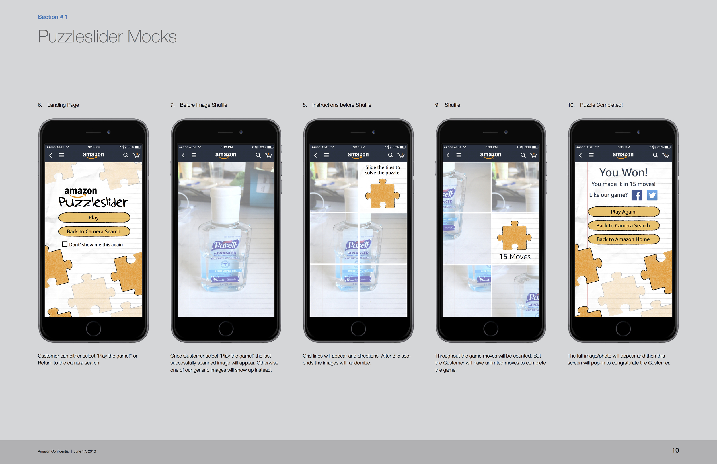
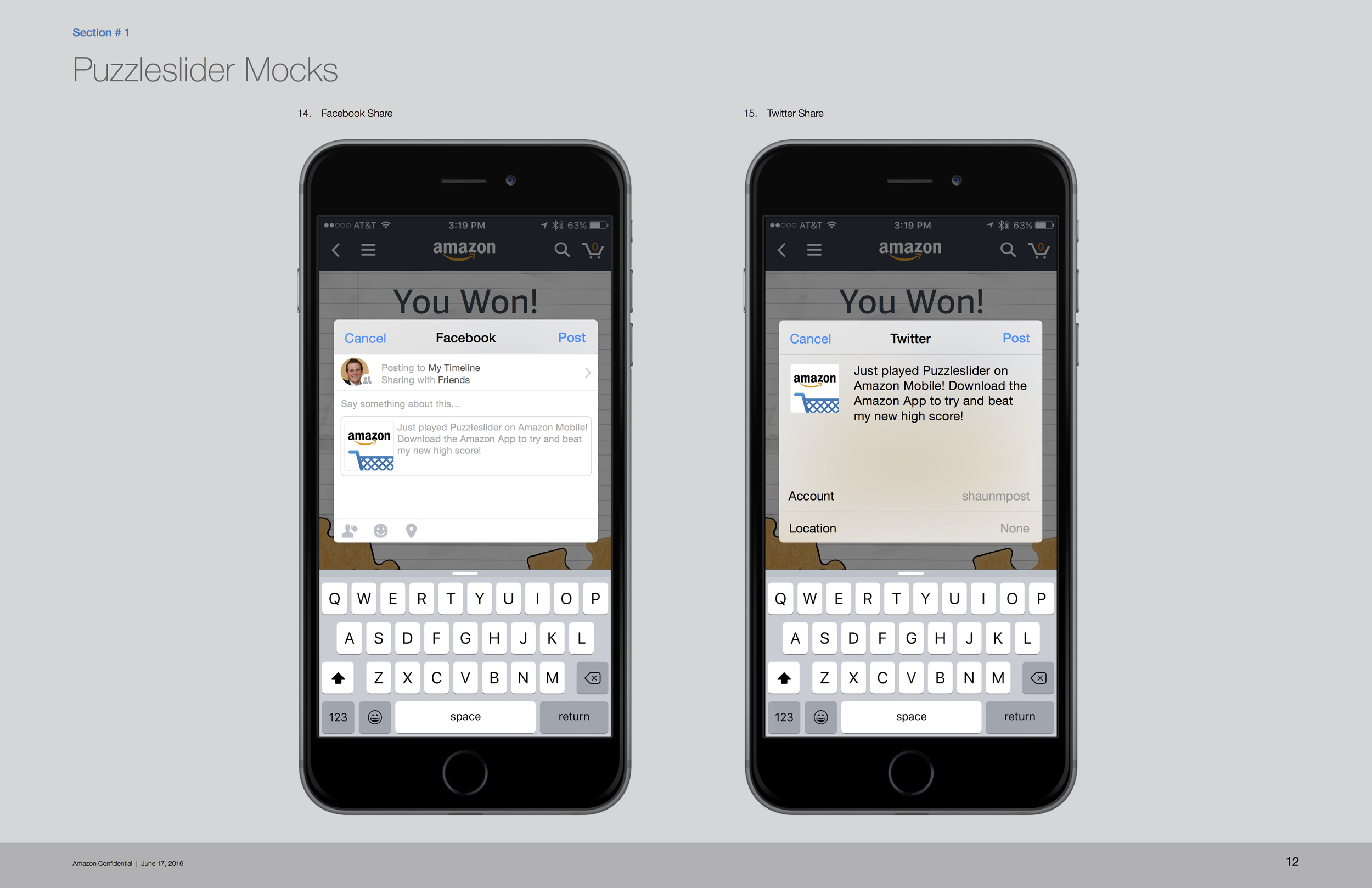
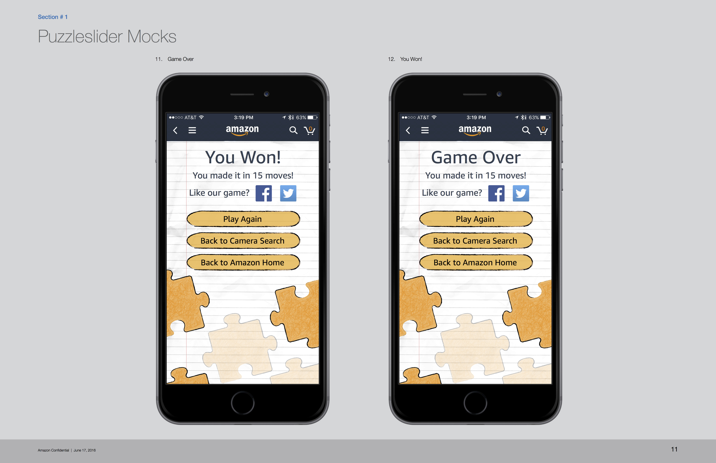
Let's play! From concept to fruition this is just a taste of the "back of the class" look and feel I was going for. Imagine those days in elementary school where you would you doodle for days on lined paper, crumbled and shoved into your backpack at the end of the day. Or even if you didn't doodle, remember all those amazing drawings on the side or top of your desk? A little nostalgia goes a long way; bringing back a classic style that excites people when they see it for the first time. Remember "Failure is a privilege" and you gain so much from something you would have never thought about.
Present
Presenting this new concept to our Leadership was very exciting. This was first time a new visual aesthetic was being submitted for approval within Amazon GUI. This visual experience was welcomed with open arms and allowed our team to begin developing and testing minigames for deployment over the next couple months.
Part III: Ship It and Repeat!
Test
Over 3 days we evaluated a pool of 5 internal candidates. Since this is a smaller feature we didn't want to put a lot of usability together until there was concrete evidence that this could be a successful delight features. During our testing we found that Customers would not want to play a game at that very moment of searching but potentially save for later or through a different ingress in the search experience.
Refine
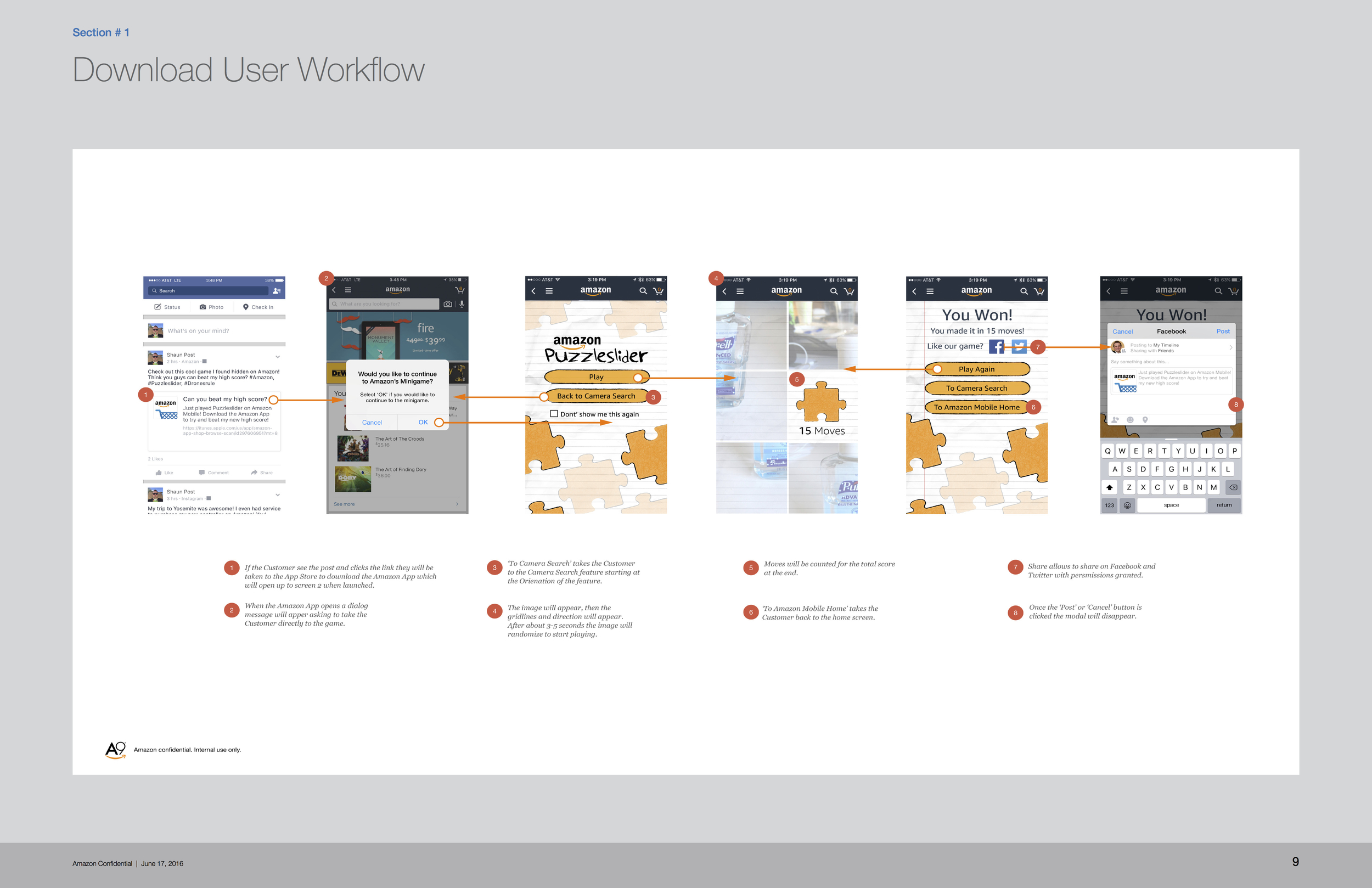
Usability showed us a lot about how the Customer reacted to this new type of delight. Some Customers enjoyed this more than others, and select few wanted more of a variety. We also found out that it's not a good idea to force your Customers into the home screen of the minigames, rather to have them stumble upon this feature. Refining the ingress was our biggest priority rather than the visual design that had already been flushed out.
Analyze
Our final analysis showed that this feature should be tested additional in a weblab 50/50. But should not launch fully until the ingress point had been clearly determined. The delight of a game works for a variety of demographic and has the potential to keep the Customer engaged until their product is found.
