Intro: Google Search and Assistant How-To Markup
Challenge + Response
Role: Design Lead for Google Search and Assistant How-To Markup
XPA Teams > AoG, Reciples, Search and YouTube
Launched: 2018 at Google I/O Developer Conference
In Assistant alone we receive ~1 million weekly queries related to how-to do things. How-To is a very large endeavor that spans multiple teams and departments across Google working towards a single solution.
Adding How-to markup to your pages will enable the page to appear as a rich result on mobile Search and on Google Assistant Smart Displays. This is an incredibly lightweight way for web developers and creators to connect with millions of people, giving them helpful step-by-step instructions with video, images and text.
Part I: The investigation begins…
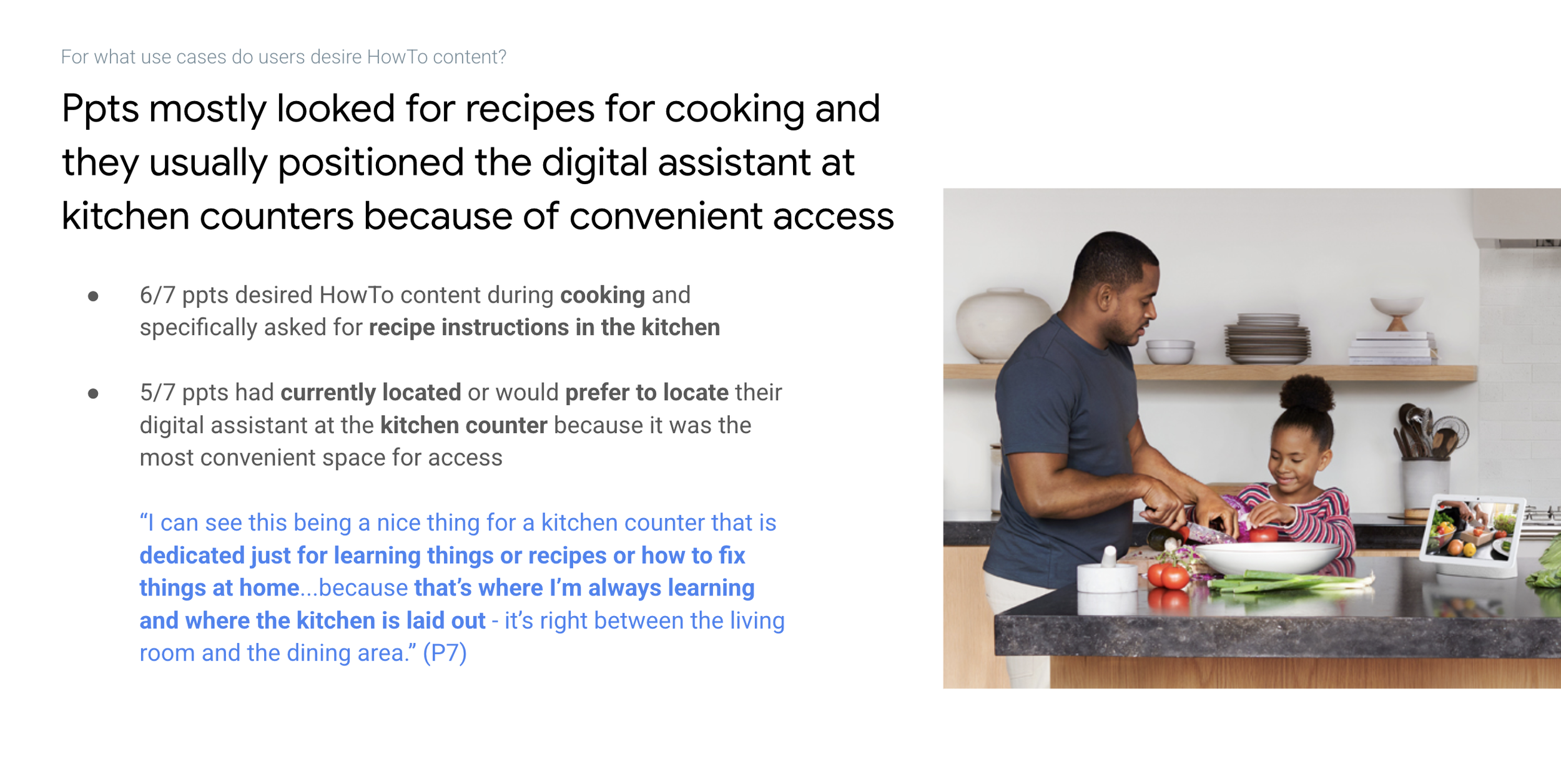
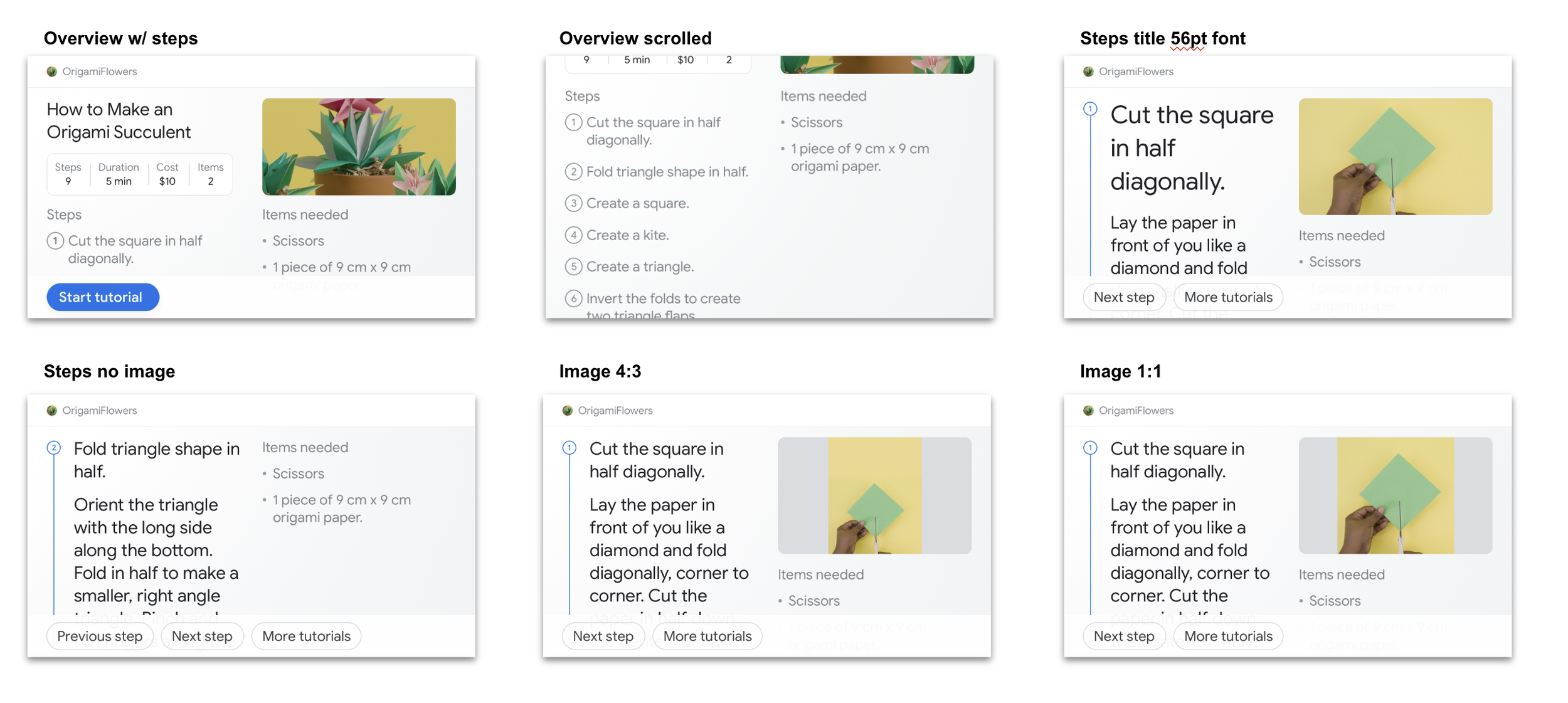
Our team partnered with the fast research program. Participants were initially asked about their experience using digital voice assistants, in addition to which devices they currently used them on. They were then given two scenarios (counterbalanced for order) and shown two different HowTo prototypes on the Google Hub; origami flower & compass. Participants were tasked to go through the tutorials and give their overall thoughts around the usefulness of the various mock screens within the flow. Moreover, they were asked how they would invoke, navigate and control certain UI elements throughout each of the tutorials.
Here’s what we found…
Cooking - Recipe for cooking x6 ppts
Travel Planning - Travel information (things to do) x2 ppts
Quick response for kids - Answer quick questions for kids x2 ppts
Home Repair - Fixing vacuum x1 ppt | How to fix the tent x1 ppt | How to repair dishwasher x1 ppt |How to install a hard drive x1 ppt
Part II: Design
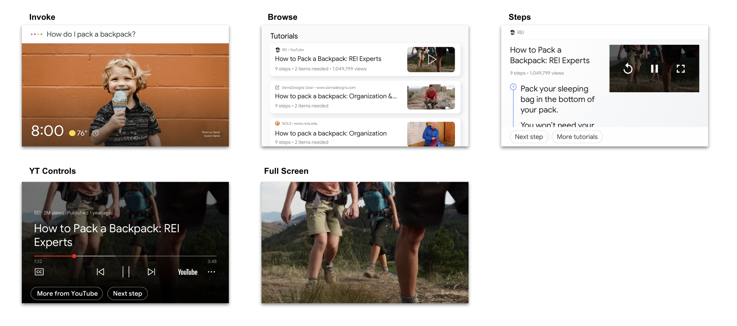
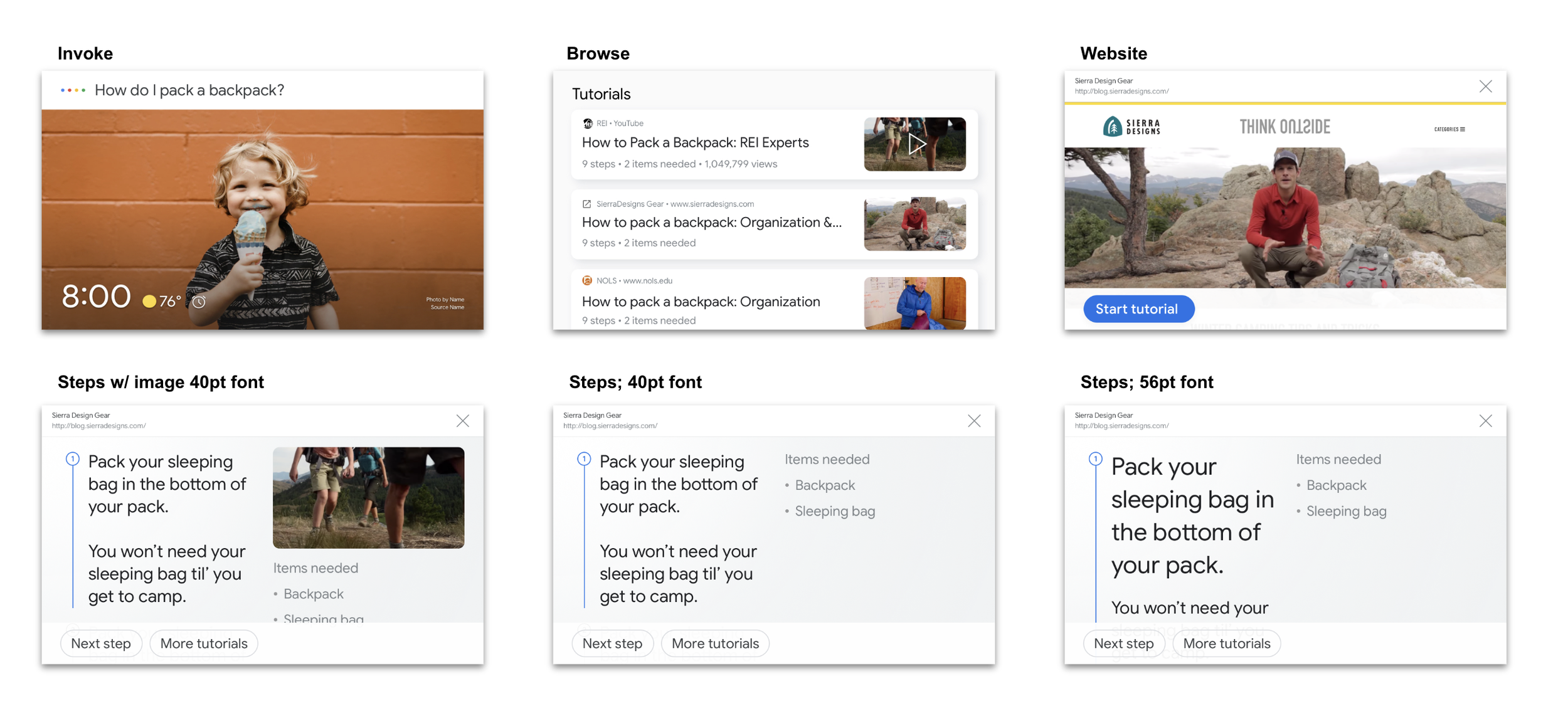
As the design lead for this space I crafted and promoted new UX patterns for smart display devices by proposing we split the screen into two viewers (50/50). By doing this we can have offerings like annotations and chips at the bottom. With minimal changes to the UI, the pattern was adopted by YouTube. Allowing for suggestion chips to be shown that are contextual to the experience. This pattern influenced cross-functional adoption of product level design not only for AoG, but also Google News, YouTube, Recipes and future teams.
Additionally, I Influenced adoption of new design patterns and product excellence with the Recipes team by establishing a cohesive design language across both of our verticals. Working extremely closely with Recipes, we explored a variety of design solutions and challenged existing patterns within the framework. In the end we came to an elegant design solution that benefits both verticals; integrating YouTube more closely.
The type of content is broken down into Implicit Text + Image, Video (YouTube) and Website Marked Up. Scroll through the images to see the variations.
Part III: Ship & Repeat
We set out to achieve our goals 1.) bringing a consistent how-to experience to Assistant users on every surface by defining the immersive step-by-step guidance experiences and 2.) creating ways to ingest structured 3P how-to content that empowers Assistant user experience. Thanks to our team and developers we were able to successfully share the development at Google I/O 2019 and get some great feedback from our developer partners (see below).
Here are some additional links to articles and overall that showcase the framework our team built.
Google Developer presentation with Chris Turkstra.
CNET wrote that How-tos will “have a significant impact on current Google gadgets in the next few months.”
Android Police wrote that "Google Search and Assistant are getting new instructional chops..."
Video Templates
100+ opt-ins to How-to templates, 25 projects that have active previews and 3 new submissions.
3K total page views for How-to template.
Mark-up
300 sites implemented How-to markup.
16K+ total page views for how-to markup dev docs.
4K+ total page views for How-to and 3K+ page views for FAQ content actions. How-to and FAQ got the most traffic within content actions docs.


