Intro: Google Restaurant Reservation (using Duplex and Madden on Smart Display Devices)
Challenge + Response
Role: Design Lead for Restaurant Reservations
XPA Teams > Speech, NLU, Assistant, Nest, Geo and Platform
Launched: 2020 on all Mobile and Smart Display Devices that supports Google Assistant
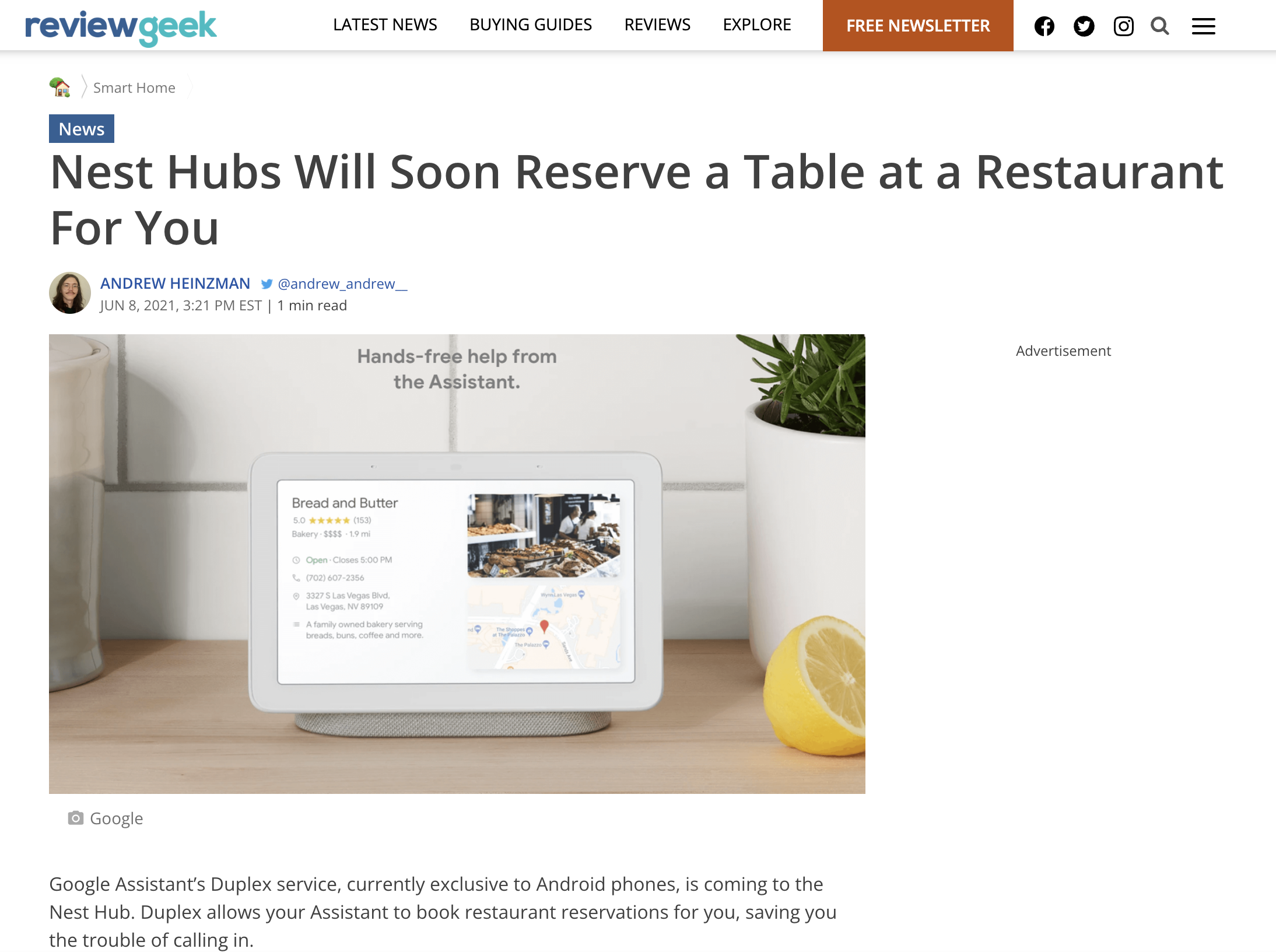
I led design of a small and nimble team to drive new design patterns for a touch and voice forward experience focused on reducing punts displaying search result pages on smart display. This flow included improving the ‘Book a table’ flow for participating restaurants which enable table reservation via Madden reservation UI iframed onto smart displays. Allowing for more accessibility using voice to trigger and completing your booking.
Additionally, I assumed ownership and responsibility for how UX would bring together Search and Assistant capabilities to reduce punts of all queries on smart displays by creating a search fallback; giving users get more guided answers (5% of all DG queries are punts / 30% of all queries are info-seeking).
Featured: Google Store Marketing
Part I: The investigation begins…
Current Experience on SD is not great. Restaurant results offer inconsistent experiences:…
Most restaurant cards offer only calling and/or direction info.
Some restaurants offer an option to book a table or order food from the restaurant.
Not clear to users what to expect when issuing a query to book a table or order directly.
‘Book a table’ flow is not optimized for touch (SD)
Leverages VUI flow (built for Chirp) (to be deprecated).
Suggestion chips often not in sync with user-flow.
Available times/table-size do not reflect restaurant inventory.
Not supported for all restaurants (relies on restaurant inventory integration via 3P (e.g Opentable).
‘Order food’ flow is not optimized for touch (SD)
Relies on ‘send-to-phone’ to complete flow.
Supported only for restaurants participating in FOPA program.
Part II: Design
We started by focusing on the two ways users can book reservations with touch and voice. By using voice we can disambiguate the restaurant, location and other specifics to arrive at the booking confirmation.
With touch it’s a bit more involved. My goal was to make this as frictionless as possible, but still give users a ways to discover restaurants they may not have known about before. As you can see in the flow there are 6 states to this flow; discovery, selection, detail page, booking, booking details and confirmation. Each one of these had it’s own design review and setup given we engaged with various teams that owned unique states of the design process.
For example Geo was responsible for the booking and booking details. Duplex was responsible for the selection, detail page and confirmation. As an Assistant design lead, I was challenged and responsible for bringing the teams together to deliver a cohesive solution.
Below you’ll see the various method’s our team took to accomplish this feat. By redesigning the states of the end to end flow. We were able to provide solid recommendations for path to launch.
Part III: Ship It and Repeat!
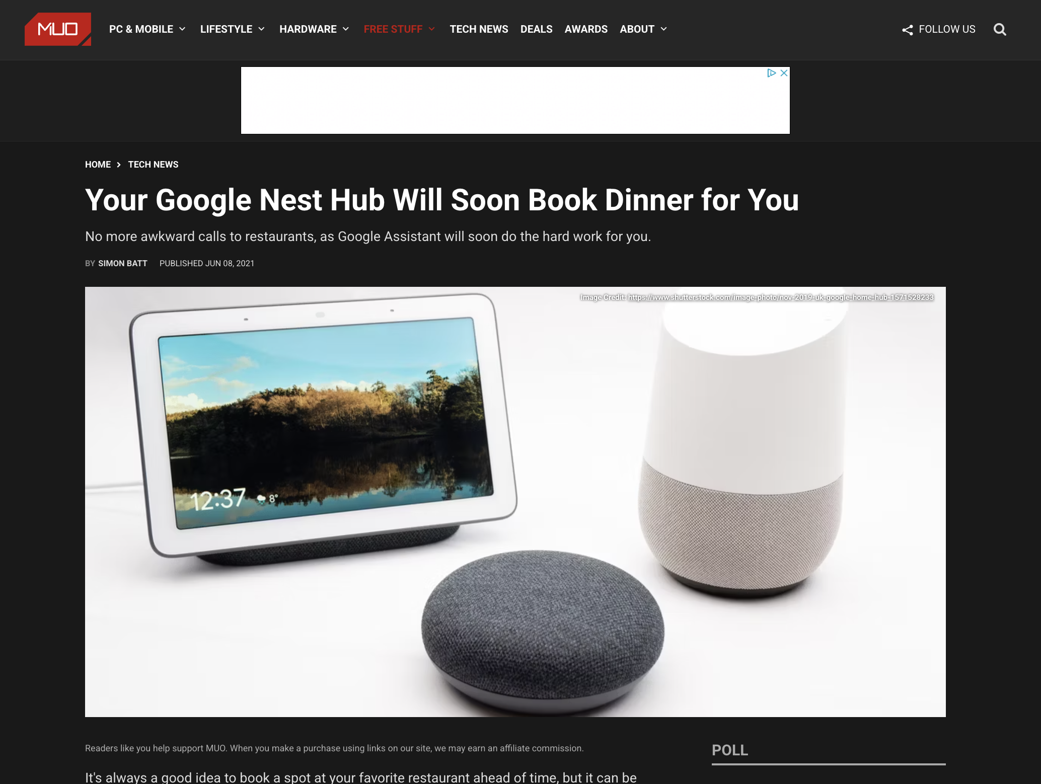
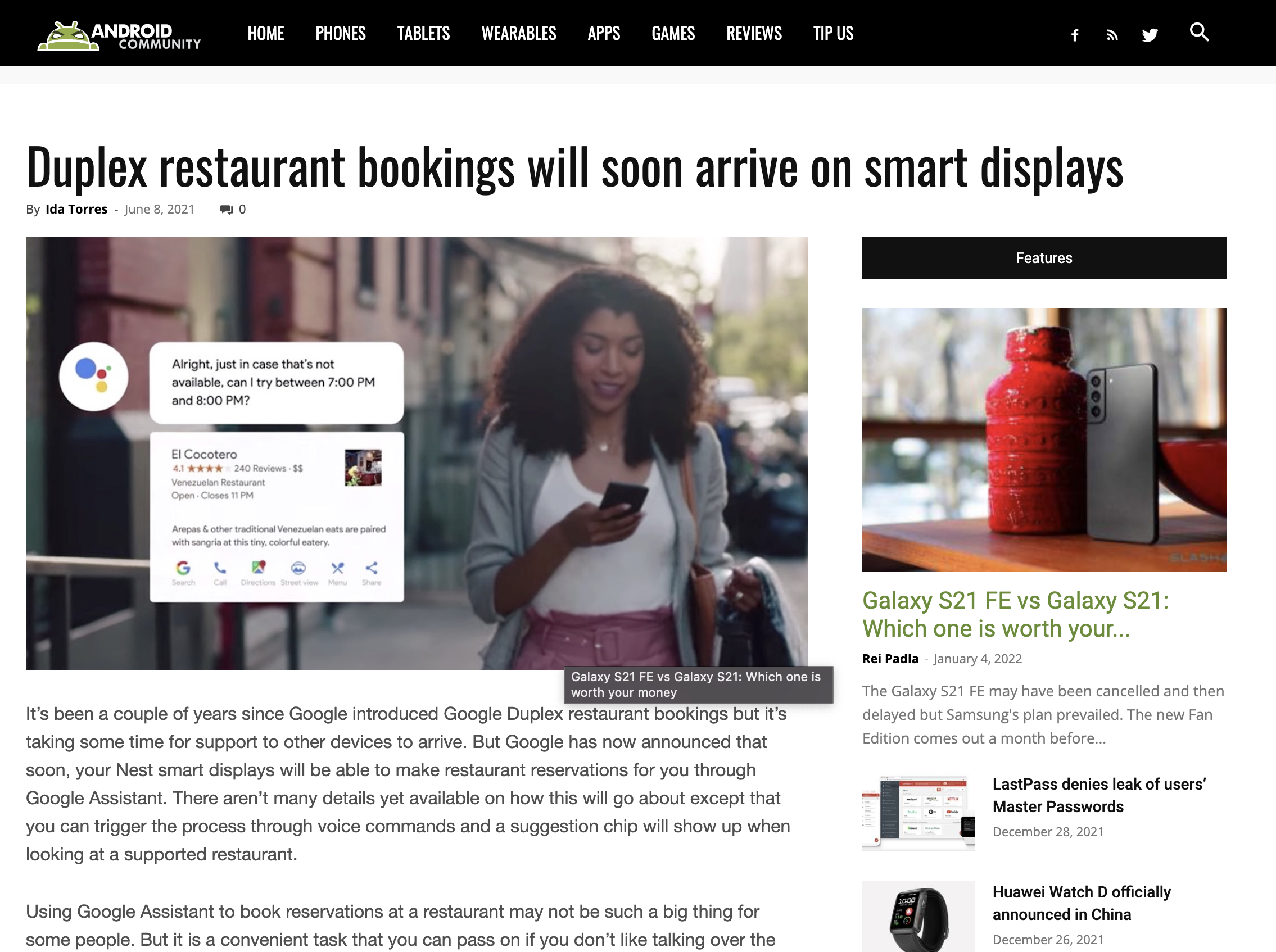
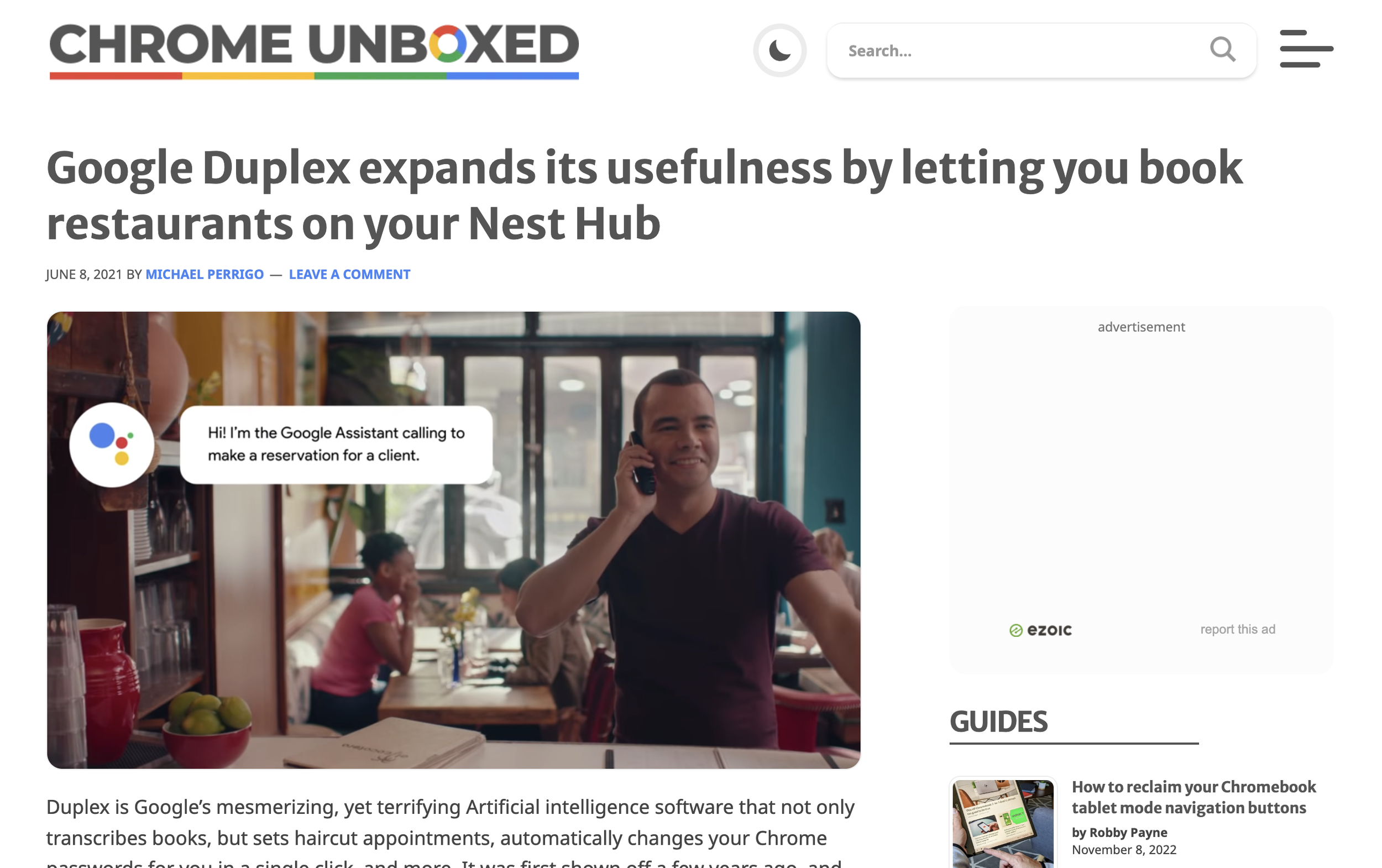
Successful launch with great press…


